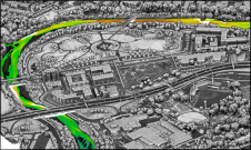
Medical Mapping
Importance of Coordinates and Geo-referencing
The great strength of geomatics is that it enables us to place earth-related object data, geodata, within a spatial context. Maps and GIS are becoming increasingly important in properly planning, managing and monitoring public health programmes. Starting with John Snow's famous cholera map, we discuss the importance of coordinates and geo-referencing in medical mapping.
Suppose the government of some country wants to register data on all the buildings erected in its territory. Registration is aimed not only at property-tax collection but also at granting building permits, distributing petrol-station licences and many more tasks of good governance. A government officer with a background in law, economics, accountancy, sociology or demography (LEASD) is probably inclined to define the attributes of the data as 'building identifier', 'address', 'floor area', 'number of storeys' and 'use'. The same officer will also want a reference to the document lending official approval to the existence of such an object.
On Horseback
A public health statistician with a background in geomatics engineering, however, would shake his head pityingly. His comment might be, 'This dataset will not allow me to assess the health effects of reducing particulate matter in the air or the spread of a contagious disease, even when I combine your building register with the population register and with the registers of the Department of Health.' In reply the LEASD officer would sniff, 'Of course you can! You can combine the information through the address and then draw everything on our fine street map.' More emphatic head shaking might follow, and the geomatics specialist respond, 'Yes, that is an option. But how tedious and nerve-wracking that would be, how time-consuming and costly! And it would only allow me to compute alternatives at the cost of many man hours, if at all.' Adding in exasperation, 'Next time you travel to London I will recommend your boss send you on horseback. We are no longer living in the days of Doctor Snow.”
A Grand Experiment
Who was Doctor Snow? Son of a Yorkshire farmer, John Snow (1813-1858), was a London medical physician and pioneer in the fields of epidemi-ology and anaesthetics. He contributed 82 publications to the scientific literature, including many on chloroform, and proved by assembling maps and statistical analysis that cholera was transmitted by contaminated water and not by 'miasma' (bad air), as was the prevailing theory at the time. During the cholera outbreak of 1853-1854 he was able to prove his hypothesis by showing that public water supplied to south London residents by private companies was a key factor in the communication of the disease. In contravention of new regulations, Southwark and Vauxhall Water Company was still taking water from local wells and from the River Thames as it ran through central London, while the Lambeth Company had begun taking its water from the Thames about twenty miles upstream of the city. The two companies served different areas, but there was a large area of overlap within which the two delivered water through different pipes. Snow outlined the supply areas on a map and started counting deaths from cholera. The statistics thus derived proved a strong correlation between the deaths and water source (Table 1).
Although this 'grand experiment', as Snow himself called it, confirmed his hypothesis, he also wanted to acquire evidence on a local scale. For this he carried out research in his own residential district of Soho, served by both water companies. He plotted on an existing street map the homes of victims of the Soho cholera outbreak of August 1854 and identified a water pump in Broad (now Broadwick) Street as the source of the disease in that neighbourhood. Removal of the handle of the pump and sealing off the water source resulted in an immediate fall in infection rate. It is this map analysis on the local scale of Soho that made Snow famous.
Spatial Context
In Snow’s map, spatial correlation between deaths from cholera and distance to the pump in Broad Street is obvious, and once recognised can be no longer overlooked. Identification is also aided by placing the pump at the centre of the map, and for today’s readers by marking this particular pump in red. However, for a relationship to be readily seen one needs prior notice of correlation. This implies formulation of a hypothesis. From his work among coal-miners, who "suffered more from cholera than any other" population, Snow became convinced that the bad sanitation and water facilities in the mines had to do with communication of the disease. "There are no privies in the coal pits and I believe this is true of other mines: as the workers stay down the pit for about eight hours at a time they take food down with them which they eat, of course, with unwashed hands. As soon as one pitman gets the cholera, there must be great liability of others...to get their hands contaminated, and to acquire the malady," he wrote in 1854 in the second edition of his groundbreaking publication
On the Mode of Transmission of Cholera. The map enabled him to prove that the cause of the disease was water contaminated with excrement from infected people. Since he knew what he was looking for, it was just a matter of plotting deaths from cholera and the source of drinking water, pumps, within their spatial context. Someone believing that bad air was the cause could have plotted cholera deaths within the spatial context of manure heaps and main wind directions. But nobody did. Although the map convin–cingly proved Snow’s hypothesis, it still took another decade before his germ theory was widely accepted.
Yellow Fever
The use of maps to show correlation between spatial phenomena and contagious disease was already established more than half a century earlier. In the late eighteenth century Dr Valentine Seaman, a surgeon at New York Hospital, compiled a map of deaths during an outbreak of yellow fever in what is now the Lower East Side of Manhattan. He was attempting to prove that foul and putrid waste caused spread of the disease. More than a century later, around the fin de siècle, a US commission led by Walter Reed investigated why during the Spanish American War of April to August 1898 so many American soldiers died from yellow fever, more than from fighting. The Reed Commission proved by deliberately infecting mosquitoes and allowing them to feed on volunteers that the mosquito Aedes aegypti was responsible for spreading the disease. Most infected people recovered.
Vital Coordinates
'We are no longer living in the days of Doctor Snow,' said the geomatics engineer. What he meant was that the government LEASD officer just wanted, in the tracks of John Snow, to use address records to geo-reference earth-related phenomena. Combining different geo-datasets with each other and with other datasets by means of address is only feasible when the amount of objects and the number of attributes assigned to each is fairly small. This is because the procedures involved require a lot of manual processing. However, today’s datasets are often mammoth-sized. Furthermore, all geo-sciences have made mathematical their understanding of the spatial and temporal dynamics of pro–cesses of the parts of the real world they study. Today all real-world processes are modelled as systems of mathematical equations, some more complex than others; and these systems have been transmuted into algorithms. This allows calculations involving such cumbersome and tedious exertion for us humble human beings to be done by computers, fast and free of blunders. In addition, today’s scientists are no longer happy simply proving spatial correlation through visual inspection alone. Referring to Snow’s map, one would today compute all distances from each pump in the district to all the spots where somebody died from cholera, add up the distances per pump and calculate the averages. Then one would determine the minimum of these averages and show that the averaged distance to the pump in Broad Street was significantly smaller than the averaged distance to the other pumps. Or alternatively one would draw circles, all of the same radius, around the pumps, count the number of deaths within each circle and prove by statistical testing that the number in the circle around the pump in Broad Street was significantly higher. In order to carry out these computations by computer the locations of the houses and pumps need to be identified in the form of coordinates, all, of course, related to the same geodetic reference system.
WHO
Today the World Health Organisation (WHO) recognises that GIS systems are highly suited to analysing epidemiological data and discerning trends and correlations difficult to discover in tabular format. And that GIS allows policymakers to enhance application of resources because the spatial correlation of diseases, health services and terrain characteristics can be easily visualised. Since 1993, the WHO Public Health Mapping and GIS programme has promoted GIS as tool for:
- determining geographic distribution of diseases
- analysing spatial and temporal trends
- mapping populations at risk
- stratifying risk factors
- assessing resource allocation
- planning and targeting interventions
- monitoring diseases and interventions over time.
Concluding Remarks
Since the twentieth century Snow has been often portrayed as the genius responsible for single-handedly discovering the cause of cholera, and by the GIS community as the mastermind who invented medical mapping. Although some criticise the mythical proportions attributed to his achievements, Snow’s maps remain the most famous classical example in the field of medical mapping and his study is a landmark still taught today. Koch (2005) has written a comprehensive monograph on medical maps, the history of medical geography and the potential contribution of cartography to understanding and combating disease. The University of California Los Angeles, Department of Epidemiology maintains a John Snow website.
Further Reading
Vinten-Johansen, P., Brody, H., Paneth, N., Rachman, S., Rip, M., 2003, Cholera, chloroform, and the Science of Medicine: a Life of John Snow, Oxford University Press, New York, Oxford, UK, ISBN: 0-19-513544-X.
Stevenson, L., 1965, Putting Disease on the Map: The Early Use of Spot Maps in the Study of Yellow Fever. Journal of the History of Medicine, Vol. 20, pp 227-261.
Topper, J., 1997, Yellow Fever/Reed Commission Exhibit: ‘This Most Dreadful Pest of Humanity,’ Yellow Fever and the Reed Commission 1898-1901, University of Virginia.
Koch, Th., 2005, Cartographies of Disease. Maps, Mapping, and Medicine, 1st ed. Redlands, California, ESRI press.
Koch, Th., Denike, K., 2006, Rethinking John Snow’s South London Study: A Bayesian Evaluation and Recalculation, Social Science & Medicine, Vol. 63, pp 271-283.

Value staying current with geomatics?
Stay on the map with our expertly curated newsletters.
We provide educational insights, industry updates, and inspiring stories to help you learn, grow, and reach your full potential in your field. Don't miss out - subscribe today and ensure you're always informed, educated, and inspired.
Choose your newsletter(s)