Against the ‘How to Lie with Data’ Classification
New Task-oriented Methods for Designing Choropleth Maps
Choropleth maps are widely used for presenting population density, social index or other normalized statistical values related to spatial units. One of the ‘white spots’ on the research and development ‘map’ of cartography is that conventional methods for creating choropleth maps are data driven and may lose extreme values or small clusters of extreme values (hot spots) due to an unfavourable setting of class breaks. In this article, the author presents a new method and evaluation measures which enable better preservation of important spatial characteristics. The methods and software implementation result from the aChor project.
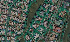
The choropleth map is a popular way to visualize thematic data, such as population density per spatial unit for example. The spatial units are coloured or shaded depending on value. The values are usually grouped into classes, and the classes with the lowest values are assigned less dominant colours or shades than classes with higher values. Spatial units may represent administrative areas such as municipalities, departments (e.g. in France), states (e.g. in the USA), counties (e.g. in Germany) or physical entities such as watersheds. Since each spatial unit receives one value, the number of values equals the number of spatial units. Choropleth maps give a quick and easy impression of how thematic data varies across a country or other geographic area. They are easy to interpret, but the simplification of the data introduces the risk of misinterpretation by the user or loss of essential information, such as extreme values. This affects visual perception, interpretation and decision-making, a topic which has been extensively covered by Monmonier (1991) in his book titled 'How to Lie with Maps'.
Existing Classification Methods
The transformation of the value range of thematic data to classes, called classification, requires the number of classes to be defined, the value range to be divided into the same number of intervals as the number of classes, and the colours or shades to be selected. The setting of the intervals is done by introducing thresholds, called class breaks. The setting of the class breaks in standard GIS and cartography software can be done in several ways, including:
- Dividing the value range into equal intervals (equidistant)
- Assigning the same number of values and thus spatial units to each class (quantiles)
- Detecting gaps in the value range and setting the class breaks at these gaps (natural breaks or Jenks optima)
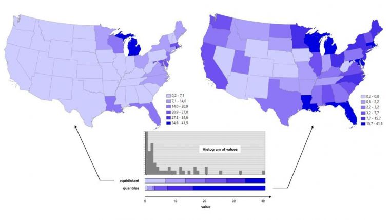
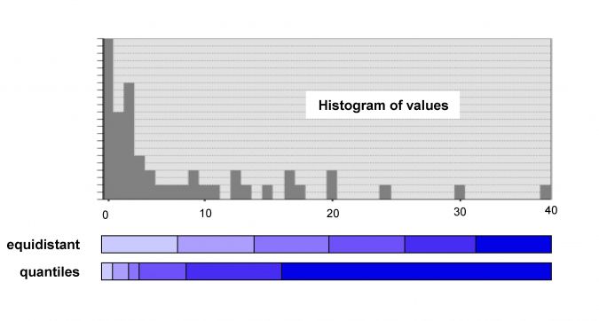
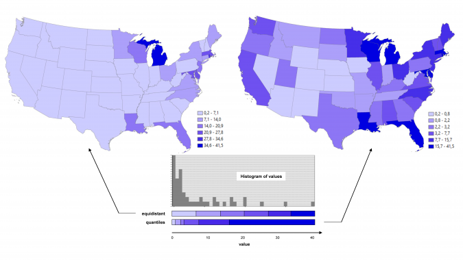
Figure 1 shows a histogram of the percentage of each state in the USA covered by water bodies. The histogram shows obvious gaps. This underlines that the choice of method, the setting of the number of classes, the many low values and the presence of isolated values significantly impact on the classification results. Although there is no one-size-fits-all classification method, it is possible to quantify the degree of uncertainty of the classification using measures. The aChor project developed and implemented measures for quantifying thematic uncertainty, spatial pattern and visual perception.
Thematic Uncertainty
The variances of the values per class provide a measure for the thematic uncertainty. A low variance for each class is preferred since this guarantees that all values within the same class are similar or even identical, which reduces uncertainty. The within-class homogeneity describes the variation of values belonging to one class and is calculated as a variance measure, called Goodness of Variance Fit (GVF), which is the normalized squared differences of the values from the class mean. Normalized means that GVF may vary between zero and one. In Figure 2, the equidistant method suggests uniform behaviour with very few outliers resulting in a GVF of 0.77. This is better than the quantile method, which suggests more variety and higher values resulting in a GVF of 0.58. Alternatives are between-class heterogeneity or within-class matching values. Emphasis is often on the classes at both ends of the value range. One possible goal is the isolation of global extreme values. A measure, called GEX, can look for the – desirably small – number of elements in the two classes at the end of the value range and relate these to the number of elements that would appear in an equally distributed manner (GEX=0). A GEX value of +1 corresponds to one value in each of the two extreme classes. Applied to Figure 2, the quantile method has a nearly equal distribution (GEX=-0.04) while the equidistant method results in a GEX of -1.02 due to the many values in the class at the low end of the value range.
Spatial Uncertainty
Equidistant, quantiles, Jenks or other conventional methods are data driven and thus do not necessarily preserve spatial patterns. Extreme values, hot spots, edges or clusters might therefore get lost. Spatial uncertainty measures are rare. One of the measures is concerned with the preservation of local extreme values of spatial units. These spatial units show a larger (smaller) value compared to all neighbouring spatial units. Consequently, the data classification should not aggregate neighbouring spatial units into the same class assigned with the extreme value spatial unit. Of the 17 spatial units with an extreme value in Figure 2, the quantile method preserves 65% and the equidistant method 29%. To tackle the loss of spatial patterns by classification new task-oriented approaches are developed in the aChor research project (Chang & Schiewe, 2018), offering an alternative for GIS users and cartographers. For preserving extreme value spatial units, among all neighbours, the minimum of the absolute difference values is identified and stored together with the local extreme value. Later, at least one class break has to be placed within this interval. Class break setting is performed by applying a plane sweep algorithm.
Perceptual Uncertainty
Dominant colours strongly affect visual perception, which is beneficial when spatial units with high values are rare. But large spatial units with high values are perceived more dominantly than smaller ones with the same high value, which is detrimental in many cases. A measure to quantify the proportion of the geographic area covered by one class is the ratio of the area covered by the class and the area of the entire geographic area divided by the number of classes. Applying this measure, called global visual balance, to the two choropleth maps in Figure 2 results in 0.77 for the quantile method and 0.22 for the equidistant method. The difference is caused by the area dominance of the class at the low end of the value range in the equidistant map. To detect huge area differences within the same class, the largest and smallest areas within the class may be considered, resulting in a measure called within-class visual imbalance.
Evaluation
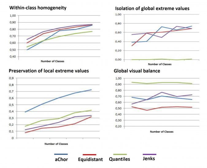
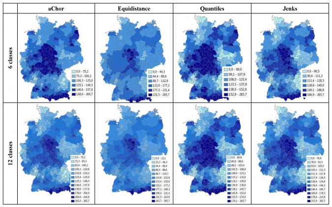
The performance of the measures was evaluated on various datasets. Figure 3 gives an example showing similar trends and values concerning within-class homogeneity for all methods – with Jenks being best and quantiles worst. Isolation of global extreme values shows strong variations. The quantile method shows weak values close to zero. In general, equidistance shows best results. Preservation of local extreme values shows monotonically increasing measures with an increasing number of classes for all methods. aChor always shows significantly better results. Global visual imbalance appears best with quantiles, resulting from the similar sizes of the spatial units. Equidistance always delivers the worst results. Figure 4 shows eight choropleth maps of a rainfall dataset for Germany using four classification methods and division of the rainfall data value range into six and twelve classes.
Concluding Remarks
Within the aChor project the methods have been implemented as a plug-in tool embedded in open-source QGIS, using open-source Python modules such as GDAL (Geospatial Data Abstraction Library), PySAL (Python Spatial Analysis Library), Fiona, Shapely and RTree.
Further Reading
Chang, J. & Schiewe, J. (2018) An open-source tool for preserving local extreme values and hot/cold spots in choropleth maps. Kartographische Nachrichten, 68(6): 307-309.
Monmonier, M. (1991) How to Lie with Maps. University of Chicago Press.
Schiewe, J. (2016) Preserving attribute value differences of neighboring regions in classified choropleth maps. International Journal of Cartography, 2 (1) 6-19.
Schiewe, J. (2018) Development and comparison of uncertainty measures in the framework of a data classification. Int. Arch. Photogramm. Remote Sens. Spatial Inf. Sci., XLII-4, 551-558.
Lab for Geoinformatics and Geovisualization: www.g2lab.net

Value staying current with geomatics?
Stay on the map with our expertly curated newsletters.
We provide educational insights, industry updates, and inspiring stories to help you learn, grow, and reach your full potential in your field. Don't miss out - subscribe today and ensure you're always informed, educated, and inspired.
Choose your newsletter(s)